
Company: The Trade Desk
Role: Senior Manager, UX Design
Year: 2026
Summary: I guided my team to define how users would interact with an AI-powered product selection experience, informed by user research and our understanding of human behavior.
Skills: Product Strategy, User Research, Interaction Design, Conversation Design
Background
FMCG advertisers use retailers’ (e.g. Walmart) purchase data to better understand and reach consumers based on what they actually buy. To request this data, advertisers first need to specify which products they’re interested in by searching the retailer’s often vast product catalog and creating a list of relevant products. Finding and selecting the right products is therefore a critical first step in using retail data for advertising.
Our existing product supported two ways of selecting products. Structured requirements that mapped cleanly to product data (such as brand, category or price) could be defined using filters, allowing the resulting product list to update dynamically as the catalog changed. More nuanced requirements, such as products relevant to a “back-to-school” promotion, required users to manually search for and add individual products.
After demonstrating the value of an AI-powered product selection using nuanced, natural-language concepts and securing leadership support and resourcing for a working prototype, our product team now had to turn the concept into a concrete product experience.
My Role
As Senior Manager, UX Design for the product team, I led the UX work for this initiative, with a particular focus on turning the AI concept into an experience that users could understand, use, and come to trust.
Given the strategic importance of this work to the company’s broader AI efforts and the relative newness of these interaction patterns, I worked closely with a junior designer on my team and our developers to define the experience, then iteratively validate and refine it through user testing.
Key Design Decisions
Initial Selection
Product selection could be done in two ways: by setting strict criteria (such as brand or category) or by searching for and adding individual items. Our new AI-powered selection enhanced only the latter.
Our initial designs therefore preserved this existing structure, introducing AI as an enhancement only within the individual-item flow.
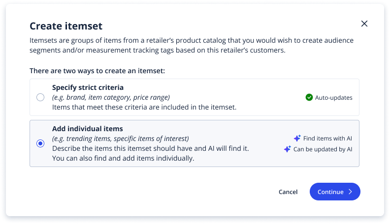
After user testing, we found that this design was confusing for people who weren’t already familiar with how product selection worked. We realised that users perceived AI-powered selection to be a distinct way of building an itemset rather than as a feature within manual selection – even though it was technically implemented as such.
The interface also tried to explain too much upfront. Dense copy and multiple badges added visual noise without meaningfully helping users choose between the options.
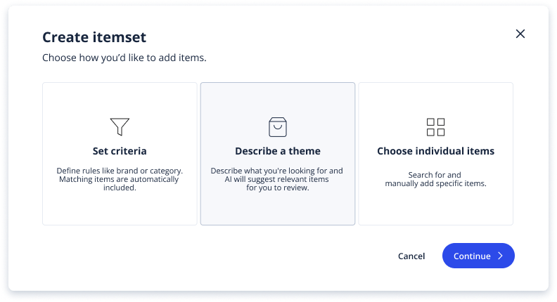
We therefore chose to depart from the underlying technical structure and design around three distinct user intents instead. This separated AI-powered selection from manual selection and made each approach easier to understand and compare.
Conversation Patterns
Introducing a conversational interface brought new design challenges – users needed to quickly understand what they could ask the agent to do, and in turn, the agent needed to clearly communicate what it understood and respond appropriately when uncertain. Through user testing across different prompts and responses, we established several interaction patterns to address these challenges.
Bring structure to an open-ended interface
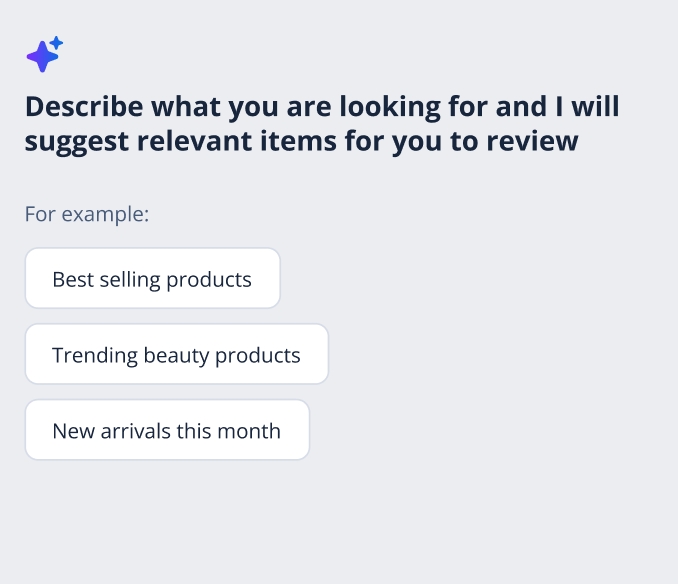
During testing, we noticed that users often didn’t know how to begin when simply shown the instruction “Describe the type of items you are looking for“. The open-ended interface provided few clues about what the agent could do or what kinds of requests would be useful.
We therefore introduced starter prompts that demonstrated the range and structure of useful requests. Rather than simply acting as shortcuts, they helped users form an initial mental model of what the agent could do.
Communicate the right level of confidence
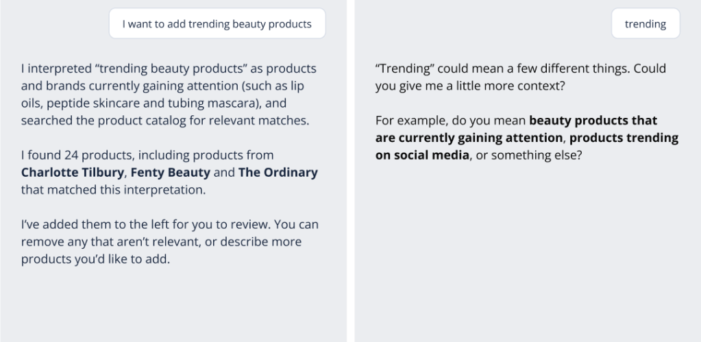
We wanted the agent to respond confidently when it understood the request, and transparently when it didn’t. For clearly understood requests, we structured responses to first explain how the user’s intent had been interpreted, then communicate what was found and what the user could do next. When a request was ambiguous, the agent instead acknowledged the uncertainty and asked for more context.
Build trust at the edges
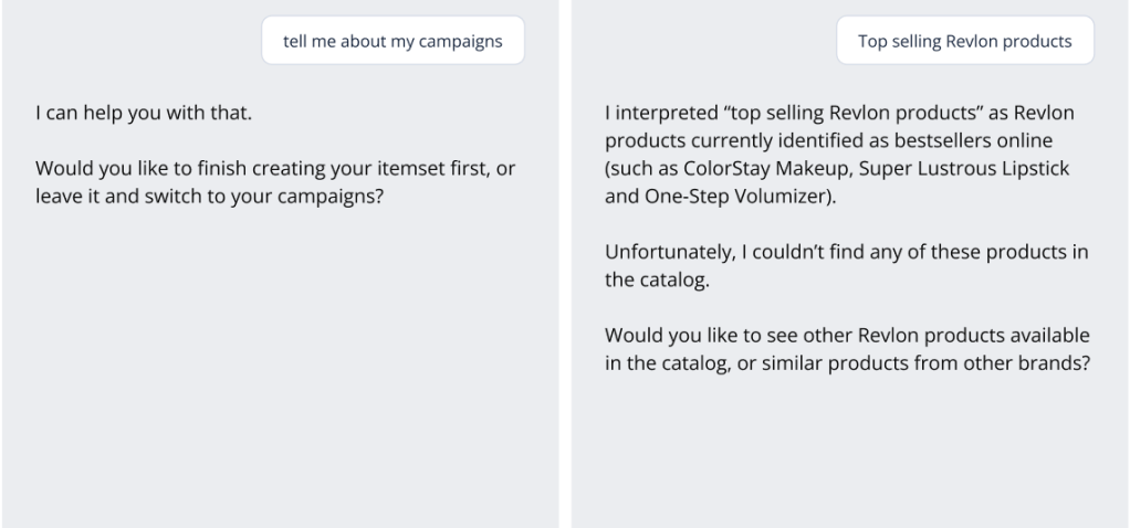
Testing also revealed that users’ confidence was particularly vulnerable when conversations moved beyond the expected paths. In early beta testing, users scored their experience particularly poorly when they encountered responses that were irrelevant, awkward or failed to acknowledge the user’s situation.
This shifted our attention towards systematically testing ambiguous inputs, out-of-context requests and retrieval failures, and designing recovery patterns that helped users continue rather than leaving them stranded.
Handing off from conversation to conventional UI
We hypothesised and later validated through user testing that conversation worked well for expressing what users wanted, but less well for reviewing and manipulating large sets of results. Rather than forcing the entire experience into the chat interface, I designed a companion workspace where products found by the agent could be reviewed, edited and removed individually. It also kept the list of products persistently in view as users continued their conversation with the agent.
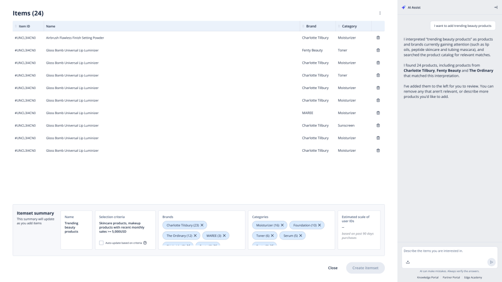
As itemsets grew, reviewing products one by one became impractical. To account for that, I introduced an itemset summary that surfaced the criteria used to generate the selection, as well as the most common brands and categories.
This gave users a quick way to make sense of what the agent had actually assembled, while also turning the summary into a control surface – users could quickly remove products from an entire brand or category rather than editing products individually.

Outcome
We eventually released the prototype internally for beta testing. Many users quickly saw value in the feature and asked when it could be released to external clients.
The broader beta also surfaced behaviours we hadn’t anticipated. As users experimented with different ways of prompting and interacting with the feature, we uncovered new edge cases and continued refining the experience.

